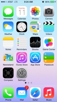
Yesterday, Apple announced iOS 7, a major change to the “world’s most advanced mobile operating system.” The most obvious change? A completely different design/user interface. Along with that came some nice new feature, including Control Center and a new multitasking system. Now that the beta has been out for a while, what are people thinking of iOS 7?
 For me, I’m enjoying it quite a bit. The updated interface took a while to get used to but, luckily, that “while” was actually quite short. The updated interface brings a new, fresh take towards mobile operating systems, consisting of bright colors and solid UI elements. All of this put together makes for an experience that’s nothing like iOS has ever really seen anymore. Sure, much of the way iOS works is still the same (grid homescreen system, various menus, keyboard, etc.), but the design is really what makes this thing so different and unique. All of the stock applications, most notably the Music player, have been updated to reflect the new design of iOS 7. If you’re not aware of the full changes, visit Apple’s iOS 7 product page.
Most of what you’ll see has a lot to do with transparency, as you’ll notice from things like the Notification Center, Control Center, keyboard, message popups, folder backgrounds, and more. This makes for an experience that constantly changes, for good or for worse.
The rest of this post is in regards to the first beta of iOS 7 that was released yesterday, so things are surely subject to change. As an opinionated person, it’s only appropriate to share how it is with people.
Early on, I noticed that the new UI animations are a bit slow. Not frame rate slow, but the length of the animations just take a bit too long. One can only imagine that Apple speeds things up with future updates.
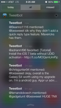
 One thing I disliked right off the bat was the updated Notification Center. Gone are the days where you could create a tweet or Facebook post from anywhere. Stock quotes and weather have been moved to the “today” tab, which I don’t see myself using much. Still left out are collapsible notification pools for when you have lots of applications with unread notifications. This is where jailbreaking may be a necessity for some, so that they can use tweaks like LockInfo or, dare I say it, IntelliScreenX.
- Lockscreen
- Control Center
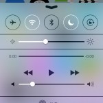
The lockscreen looks very slick. Carrying on with Notification Center, it can now be accessed on this screen, as can the Control Center, which brings toggles and other good bits of accessibility to anywhere you want. Some of these include Do Not Disturb, Wi-Fi, brightness, the media player, flashlight, and 3 app shortcuts for Calculator, Clock, and Camera. It’s not quite as in-depth as various jailbreak options, but it’s great to see native solutions finally make their way into the OS.
As this is a beta, not everything works. All of the stock apps and features do work, so it’s the third-party apps that have problems. My app selection isn’t very extensive, but I did have issues with eBay (freezes at startup, then crashes), Skype (crashes when you go to the Chats tab), and Steam Mobile (crashes upon startup). With previous iOS betas, some beta updates can fix compatibility with the apps, so we’ll have to see if that’s the case with iOS 7.
Overall, I’m incredibly impressed with iOS 7. Is it a gamechanger? To anyone who’s outside of the Apple ecosystem, probably not, but for everyone who enjoys that, then it’s a change that’s been a long time coming. Did I miss my jailbreak? A little bit, as the lack of any type of quick reply is slightly disappointing, which is made even more disappointing by the fact that Mac OS 10.9 “Mavericks” does have quick reply.
I’m sure that there are a lot of things that are missing from the post that you might be interested in knowing about, so feel free to drop a comment down below.
Feel free to follow Brian and Gadget Unit on Twitter.

