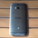
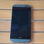
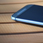
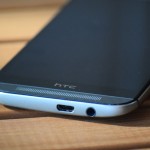
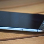
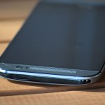
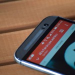
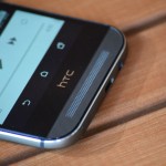
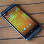
HTC’s latest One (AT&T, HTC, Amazon), also known as the M8, is the company’s latest flagship phone. It’s also one of the greatest Android-based smartphones to ever hit the shelves, combining durable, quality materials with a simple, yet unique, design. I would even go as far as to say that the M8 provides one of the most enjoyable Android experience possible.
Unboxing Video
Video Review
Specs
As expected, the new One certainly has today’s latest and greatest specs in most areas. You’ll understand why I said “most areas” shortly. For now, here’s the list of specs.
- 5-inch 1080×1920 (full HD) display
- Qualcomm Snapdragon 801 quad-core CPU @ 2.3GHz
- 2,600mAh non-removable battery
- 16GB/32GB internal storage options (microSD support of up to 128GB)
- 4G LTE/3G/2G support
- 802.11a/b/g/n/ac Wi-Fi, Bluetooth 4.0 LE, NFC
- Android 4.4.2 “KitKat”
- 4MP rear-facing “UltraPixel” camera (1080p60 video recording, no optical image stablization) + depth of field camera
- 5MP front-facing camera (1080p30 video recording)
- 5.76-inches tall, 2.78-inches wide, 0.37-inches thin
As you probably noticed, the phone’s front-facing camera actually has more megapixels than the rear-facing shooter. You also probably noticed that there are two rear-facing cameras. Why HTC went this route is explained under the camera quality section below.
Design and Hardware
Much like last year’s M7, the M8 features a metal unibody design with a zero-gap construction between the various components and sections. This results in one of the most solidly-built smartphones ever seen. Its natural competitor would be the iPhone. In addition to the materials, the M8 has a great design, with a curved back to better fit in your hand during use.
It doesn’t come without its annoyances, however. The power button is placed at the top of the already-tall phone. This makes accessing it with one hand quite difficult to where you may risk dropping the phone. I’ve also found myself accidentally hitting one of the volume buttons. On that note, it also lacks a bit of grip, naturally due to the materials. Because of this, you’ll more than likely want to use a case to help with that. All told, it may have been more appropriate to place it onto the right or left side of the phone.
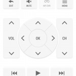
Continuing on with the top of the phone, you’ll find an IR blaster, which we’ve been seeing on a lot of devices of the past few years, including the M7. This allows you to control AV equipment, such as your TV or cable/satellite box, among others. The right side has the microSD card slot with a volume rocker right below that. On the bottom is the micro-USB port and 3.5mm headset jack. Along the left is the lone nano-SIM slot. HTC opting to use nano-SIM instead of micro-SIM was a very bold yet appropriate move. Given that a nano-SIM holds everything that an old, full-size SIM does (and of course a micro-SIM), it made sense to use this SIM standard.
The back is where you’ll find some unique offerings. The most obvious change is the addition of a second rear-facing camera, located above the main 4MP “UltraPixel” camera. Again, what it’s used for will be explained in the camera section below. You have a new dual-LED flash to the left of the main camera, with a microphone located above and to the left of it.
Lastly, the front has your dual BoomSound front-facing speakers, 5-inch full HD display as well as some sensors. Unfortunately, I noticed many of the holes for the speakers were filled with gunk that’s just about impossible to clean. This could pose a problem for people with oily skin, or those who use makeup while talking on the phone.
Speaker
HTC seems to be the only company that understands audio. When you’re listening, for example, to music, having the speaker(s) facing away from you, rather than towards you, is the complete opposite of what should actually be happening. Smartphones with bottom or side-mounted speaker(s) are a little better, as you can cup your hand around the area to amplify the audio.
With the M8 (and last year’s M7), you have two front-facing speakers, located at the top and bottom of the front of the M8. This results in a smartphone audio experience that has yet to be matched by anything else. This results in loud, clear and immersive audio. Interestingly, I noticed that, when listening in landscape orientation, the audio actually sounds even better compared to holding it in its natural portrait orientation. Landscape also resulted in somewhat of a virtual surround sound experience, one that made me want to listen to music on this phone, rather than using external speakers or headphones.
Display
In many ways, most smartphone displays can only differentiate themselves so much from each other. With the M8, the screen is just fine, and looks much like you’d expect a display in a high-end phone should look like. One thing to note is that its lowest brightness certainly could be lower. I’m hoping that a software update can do this. Until then, using the phone in areas with no light can be an uncomfortable experience, due to only being able to decrease the phone’s brightness so much. Otherwise, viewing angles are fine, and color accuracy & saturation are good while not overdoing things.
If you just so happen to crack your display, HTC’s “Advantage” program will offer a free, one-time display replacement within the first 6 months of ownership.
Software & Apps
- Lockscreen
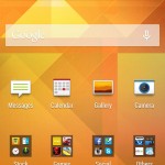
- Homescreen
- Folder
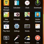
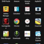
- App Drawer
- Settings
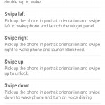
- Gestures List
- Dot View Screen
- Dialer
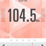
- FM Radio App
- Music App (1)
- Music App (2)
- Music App Visualizer
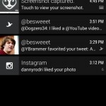
- Notifications
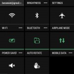
- Quick Settings
- Calculator
- Multitasking
- Stocks
- TV Remote
- Voice Recorder
- Weather
One issue with Android is that software updates aren’t rolled out to all compatible devices at the same time. Rather, carriers control when the phones get the updates. In addition to the free, one-time screen replacement program offered by HTC Advantage, HTC is also “committed to keeping you current.” What this means is that you should be able to get the latest version of Android within a reasonable amount of time, not meaning something several months afterwards.
Coming with the M8 is Android 4.4.2 “KitKat” with HTC’s “Sense 6” skin/overlay. Overlays from other manufacturers, such as Samsung’s TouchWiz and LG’s Optimus, often add a large number of features and design choices that can often get in the way of the user experience.
With HTC’s Sense 6, I never had such an enjoyable Android experience before, even compared to stock Android. The overall UI is very clean, yet simple. You aren’t bombarded with gimmicky features that you’ll never use. However, if the phone comes with something that you don’t like, such as its BlinkFeed homescreen information magazine, you can disable it. Don’t like your carrier bloatware? Feel free to disable what you can, or at least hide it from the launcher.
One thing I wish would be different is being able to customize the application shortcuts that appear on your lockscreen. It currently pulls up your dock applications. While I’m actually using the phone, what I have in the dock is what I’ll be opening the most. But when I’m at my lockscreen, I often found myself wanting to jump into a different app, such as my Twitter client (Tweetings).
Fortunately, you can use gestures to access things a tad bit quickly. For example, you can simply turn the screen on by double-tapping the display. While holding the phone, you can slide up to go straight to your last opened app, or your homescreen. You can also slide to the left to go to the phone’s widget panel, swipe right to go to the BlinkFeed homescreen (if enabled), and swipe down to turn on voice calling.
Mentioned above was the simplicity of HTC’s Android overlay. The basic apps, such as Calendar, Mail and Settings are very clean and straightforward to use. You can’t necessarily say the same for these apps on other devices. This is what I found most enjoyable with the M8, and is something that I think others would appreciate as well.
In regard to software, the weakest part is the phone’s stock keyboard. The keys are large, but its auto correct feature doesn’t work very well, if at all in some situations. If you’d rather swipe across the keys, that’s available to you, and works rather well, but doesn’t make typing with one hand much better. Luckily, Android has plenty of alternative keyboards to use.
Performance
As I’ve mentioned in some of my other smartphone reviews, I believe that we’re to the point with smartphones to where performance gains or differences aren’t very noticeable.
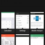
With the M8, the entire UI is smooth, but still not quite as smooth as stock Android. Applications launched quickly and performed fine afterwards. Web pages loaded quite fast as well. Gaming performance is fine across the board, but could have more consistent framerates, but that most likely comes down to optimizations within the apps themselves. Switching between apps via HTC’s multitasking interface is very fast and efficient, thanks to seeing up to 9 apps at once.
Battery Life
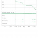
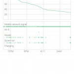
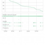
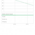
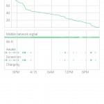
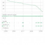
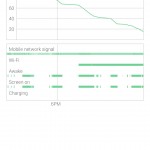
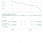
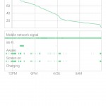
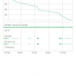
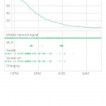
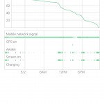
I’ve found the 2,600mAh battery in the M8 to perform rather well, especially with its power saver mode enabled. Despite it not being removable, you probably won’t need to.
During the majority of my testing, I actually left that mode on, because it left a very minor impact on general performance and usability. When playing a graphics-intensive game, you’ll want to make sure that that’s off, of course.
I don’t believe that it’s particularly useful to provide raw usage numbers, as they will vary for people depending on a wide variety of different things. With power saver off, I was usually able to get through the entire day, but would look to plugging it in at night. With power saver on, I was typically able to get through the entire day, through the night, and early afternoon. Also, my usage was with Wi-Fi off 90% of the time, using 4G LTE instead. This uses more of the phone’s resources, and really pushes battery life. Given that, battery life should be even greater when using Wi-Fi when available.
Call and Cellular Network Performance
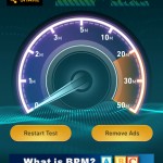
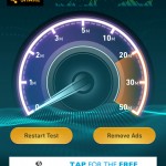
Cellular performance varies depending on a wide variety of factors, including location, time of day, congestion, etc. AT&T in San Antonio, TX, at least in terms of data performance, is a mixed bag, but is generally fine. In other words, data speeds varied quite a bit, even on a block-by-block basis, but that’s par for the course across all carriers. Call quality was good, being loud and clear on both ends, especially when using the dual front-facing BoomSound speakers. Generally speaking, cellular performance, for both data and calls, is just fine and is what you would expect a smartphone today to perform.
However, one odd thing that I noticed is that the signal bars/indicator will fluctuate quite a bit while traveling, more so than any other phone I’ve used. What I mean by this is that, you’ll have 4 bars, but a second later it’ll drop down to 2 or 1. After a few more seconds, it’ll jump up to 3 or 4, or maybe 5, and so on. This happens constantly. I can’t imagine the phone swapping towers that fast. Hopefully a software update modifies this, because I’ve read of other people noticing something similar.
Camera Quality
- Indoors
- Indoors
- Indoors
- Without Flash
- With Flash
- Outdoors (Day)
- Outdoors (Evening)
- Outdoors (Evening)
- Outdoors (Evening)
- Outdoors (Evening)
- Outdoors (Evening)
- Outdoors (Evening)
- Outdoors (Day)
- Outdoors (Day)
- Outdoors (Day)
- HDR Off
- HDR On
- Outdoors (Day)
- HDR Off
- HDR On
- HDR Off
- HDR On
- HDR Off
- HDR On
- HDR Off
- HDR On
- Without Flash
- With Flash
(For full, raw and untouched JPEGs, click through these: 01, 02, 03, 04, 05, 06, 07, 08, 09, 10, 11, 12, 13, 14, 15, 16, 17, 18, 19, 20, 21, 22, 23, 24, 25, 26, 27, 28)
What I believe is the weakest part about the M8 is its rear-facing camera. Like the M7, HTC opted to keep the same 4MP “UltraPixel” sensor, but while also removing optical image stabilization, opting to use software-based stabilization that simply doesn’t perform as well. With the 4MP sensor comes larger pixels, which HTC says offers better clarity and detail in the photos. They’re also hoping that people will simply share them online, rather than wanting to print them out, which is certainly understandable in today’s society.
General photo quality was simply alright. Some shots looked great while others looked like competing smartphones could’ve done a better job. Low light performance wasn’t bad, though. Because you’re only getting a 4MP image, you won’t be able to zoom in to see the detail as much. The camera app has a number of interesting filters and some unique features to add to your images.
Video quality was pretty good, and so was the audio, especially when listening to it via the front-facing speakers. I personally find it a positive thing when phones are able to record video at 60FPS, since the content will be much smoother than usual, similar to a live news or sports TV broadcast. The issue is that the camera app resets this setting upon each launch, with no way to get the 60FPS option to stick.
You may find the secondary rear camera, the one that’s used to capture depth information, hit or miss when selecting your point of focus. Considering much of the competition can do something very similar without the need for a secondary camera, HTC may have been better off adding a larger main sensor while doing away with the second one. The feature itself does work, and is pretty fun to play with, as are a lot of the other features that come together with the camera app.
Availability and Price
In the US, the new One is available across all of the 4 major carriers. Specific to AT&T, at the time of this review, they have the phone listed on their website for the standard price of $199.99 with a 2-year contract or upgrade. Its full, off-contract price is $639.99. If you’d rather pay that full price in monthly installments, you can pay 20 monthly payments of $32, or 26 monthly payments of $24.62. Pricing for the other carriers is more or less the same.
Conclusion
As mentioned in the intro, I’ve never had such a positive Android experience before. The M8’s great hardware, fantastic speakers and simplified Android overlay is what made all of that possible. If you can look past its iffy camera, I’m sure you’ll be very happy with it as well.
Feel free to follow Brian and Gadget Unit on Twitter.
