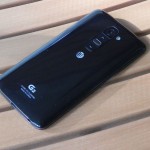
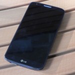
With the G2 (AT&T, LG), LG decided with a slight design change that was very much different from traditional smartphones. The change? Move the power and volume buttons to the back of the phone. That may sound awkward, but it’s not as odd as it sounds when it comes to usability. Beyond that, how well does the G2 perform as a generally high-end smartphone?
Availability and Price
In the US, the LG G2 is available across all major carriers, including AT&T, T-Mobile, Verizon and Sprint. Prices vary, but in particular to AT&T (since they provided the G2 to review), you can find it, at least at the time of doing this review, for free with a 2-year contract, or for $464.99 without a contract, nearly $200 off its original full launch price. Or, if you prefer, you can pay in monthly installments. The 20-month plan will cost you $23.25 per month, while the 26-month plan is a bit cheaper at $17.88. If you can manage to get the phone for free with a contract, that would obviously be the cheaper route. Given everything that the phone offers, the price is right.
Unboxing Video
Video Review
Specs
LG didn’t cut corners when it comes to hardware and specs, although compared to other high-end smartphones, they’re fairly common.
- 5.2-inch 1080×1920 (full HD) IPS display w/Gorilla Glass 2
- Qualcomm Snapdragon 800 quad-core CPU @ 2.26GHz
- 3,000mAh non-removable battery
- 32GB internal storage (no microSD card slot) w/22GB available to the user
- 4G LTE/3G/2G support
- 802.11a/b/g/n/ac Wi-Fi, Bluetooth 4.0 LE, NFC
- Android 4.4.2 KitKat
- 13MP rear-facing camera (1080p60 video recording) w/optical image stablization
- 2MP front-facing camera (1080p30 video recording)
- 5.45-inches tall, 2.79-inches wide, 0.35-inches thin
You probably didn’t miss it, bit in case you did, the G2 does not have a microSD card slot, so you’re limited to the 32GB of internal flash storage, with 22GB being available to the user. Depending on how much you want to put onto your phone, this can quickly fill up. In addition, the phone lacks a removable battery. In fact, the back cover isn’t removable at all. Both of these omissions are somewhat backwards from what Android devices are all about–removable batteries and expandable storage. Thankfully, the battery life is fantastic, and the storage concern could help teach people to better organize their data for efficiency.
Design and Hardware
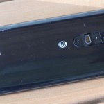
The G2 continues with less-desirable materials by using a mostly plastic construction. Despite that, the phone still feels incredibly solid in the hand. It can also be a bit slippery. Fortunately, it’s a comfortable one to hold, thanks to the slightly curved back panel. Speaking of which, the back is completely glossy and has a subtle blue, carbon fiber-like pattern to it. Overall, the design seems a bit dated, but that’s not necessarily a bad thing, since it’s still a classy looking device. I’d recommend getting a case to try and help with the grip situation.
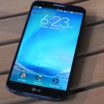
Taking a tour of the phone, the front features the 5.2-inch display (with a noticeably thin bezel), the earpiece, some sensors, the 2MP front-facing camera, a multi-color LED (for notifications), and an LG logo below the display. Gone are actual touch-sensitive navigation buttons, which is becoming common in newer devices. I personally preferred having those dedicated touch navigation buttons, which allows some extra usable screen space. However, the virtual ones are very natural after a few moments of use. You can also change the actual buttons themselves. For example, you can swap the layout of the buttons, or even add a fourth one. What’s missing as an option is a dedicated multitasking button, but holding on the home button for a moment isn’t as bad as it may sound.
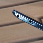
Because the power and volume buttons have been moved to the back of the phone, there’s nothing to be found on the left or right sides of the phone, except for the micro-SIM tray along the top-left. Along the top, though, is the IR blaster (for controlling your home entertainment devices, such as a TV and cable box). Lastly, the bottom of the phone houses the micro-USB port, 3.5mm headset jack as well as the speaker and microphone.
The back of the phone is where all the fun is. You have the 13MP rear-facing camera with an LED flash to the right of it. Below the camera is your volume up button, with a power button below it, followed by the volume down button. The outside of the power button can illuminate different colors to represent charging status. I initially thought that the button change was premature, but they’re certainly usable. However, there are times where I wish, at least, that the power button would be along the side, since it’ll take some extra time and effort to press it at its new location. You can turn the screen on by double-tapping on it, which helps reduce the actual need to use the power button. All three buttons are fairly easy to press and offer a modest amount of feedback.
Speaker
With HTC’s One being the only smartphone with optimal speaker placement (the front of the phone), the side of the phone is really the next best thing, while a rear-facing speaker is perhaps the worst.
Audio quality is just fine, but nothing mindblowing. It’s also not as loud as you’d expect. For casual listening and speakerphone calls, it’s fine, but I wouldn’t use it for prolonged periods of listening.
Display
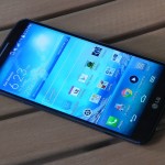
Displays in smartphones have greatly increased their pixel density and overall quality over the past two or three years, almost to the point where they can only get so good. The G2’s display is very pleasant to look at, with viewing angles that are quite good (but could be better), colors that aren’t too saturated, and touch response that’s top notch. I feel as though the smaller display bezel makes the screen feel even bigger than it really is, which is always a nice thing to see.
Of note, the display is so smooth that, if you put the phone display-down onto a surface, such as a basic table, the phone can easily glide around it, and even fall off of something.
Software & Apps
Originally shipping when the phone was first released, back in September 2013, was Android 4.2.2, known at the time as Jelly Bean. In February 2014, the AT&T model received the much-awaited update to Android 4.4.2 KitKat. With it came general performance improvements and a few minor design changes.
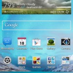
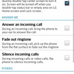
LG took a conservative approach to the amount of software-based features added to the G2, while Samsung tends to take an “all-in” approach. There aren’t very many Android customizations, but the ones that are available are worth using. For instance, you can add application shortcuts directly to your lockscreen so that you can immediately go to them after unlocking your device. Of course, the phone also features LG KnockOn, allowing you to quickly double-tap the display to turn it on, rather than having to use the power button. There are a number of other gestures, such as those specific for calling, that can be turned on or off, depending on what the user finds useful.
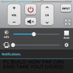
Other features include Smart screen and smart video (keeps the screen turned on or pauses the video depending on whether you’re still looking at the phone), slide aside (switch between multitasked apps by swiping), a one-handed operation mode (adjusts the keyboard and keypad size), a guest mode (allow certain apps to be displayed in this mode, for perhaps the kids to use), customizable front navigation buttons (as mentioned earlier), QSlide (bring a small set of applications up in its own smaller window on top of existing apps), Quick Remote (controller your home entertainment devices, as explained earlier), Quick Memo (lets you scribble on screenshots), and a wireless storage feature (access the files on the device wirelessly).
The UI of LG’s Android skin isn’t the best in terms of design, but it’s easy and straightforward to use. The design, however, feels dated in the sense that we’re just dealing with basic gradients and other design elements. In other words, it hasn’t really progressed in regard to the way various Android UIs have been looking like over the past three or four years. Does it necessarily need to? That depends, but something different or more modern would be appreciated.
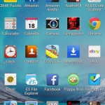
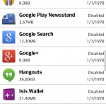
Like with most carrier-branded phones, the G2 comes with a number of preinstalled apps that, thankfully, you can completely disable (but not permanently uninstall), or at least hide from view. LG kept the disabled apps organized within the app manager so that you can quickly enable them if you change your mind. Disabling or hiding apps can help keep your apps organized so that you’ll only see the apps that you truly want to use, especially when viewing the all apps drawer. Doing so may also help with performance.
Performance
Across the board, the G2’s performance is excellent. I’m quite critical of speed and the smoothness of software, and the G2 didn’t disappoint. Apps loaded quickly and performed well after doing so. Websites, via Chrome, loaded within a reasonable amount of time. Games were generally smooth and looked great on the full HD display. Overall, performance was great, other than some inconsistent frame rates among higher-end Android games (seems to be typical across smartphones, though). Like with display quality, I think that we’re to the point in smartphone technology to where basic performance can only be so fast.
Battery Life
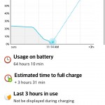
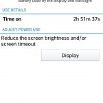
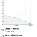
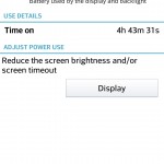
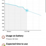
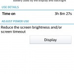
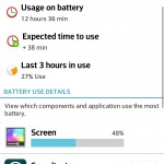
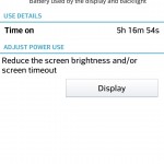
Another area where the G2 excels includes battery life. During most of my testing, I left Wi-Fi off. This was because using your cellular data is more demanding on the phone’s resources when compared to Wi-Fi. So, even with Wi-Fi off, I was easily able to get through the entire day with moderate to heavy usage. This included loading many web pages, sending and receiving a few texts and calls, playing some light games, checking Twitter and email regularly, and taking some phones and videos. Standby time is also very good, which should then allow you to get through the night and most of the morning. If you conserve your usage habits some, numbers would be even better. Even more, the phone’s battery saver mode proved to be beneficial, allowing the phone to last even longer at the expensive of performance, but only by a little bit. With general use, the phone didn’t seem to slow down much with this mode enabled, so it may be worth leaving on all the time unless you need to do some more demanding tasks, such as playing a graphics-intensive 3D game.
Call and Cellular Network Performance
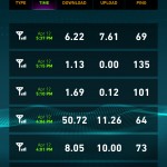
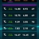
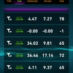
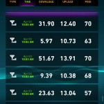
Cellular performance varies depending on a wide variety of factors, including location, time of day, congestion, etc. AT&T in San Antonio, TX, at least in terms of data performance, is a mixed bag, but is generally fine. In other words, data speeds varied quite a bit, even on a block-by-block basis, but that’s par for the course across all carriers. Call quality was good, being loud and clear on both ends. Generally speaking, cellular performance, for both data and calls, is just fine and is what you would expect a smartphone today to perform.
Camera Quality
- This was originally taken with Instagram, but not the actual Instagram photo.
- Normal
- Normal
- Normal
- Normal
- Normal
- Normal
- Normal
- Normal
- HDR on
- Normal
- HDR on
- Normal
- HDR on
- Normal
- Normal
- Zoomed in
- Zoomed in
- Fast-moving subjects can be difficult to capture when not in sport mode
- Following subjects while in sport mode
- Following subjects while in sport mode and zoomed in
- Following subjects while in sport mode and zoomed in
- Following subjects while in sport mode and zoomed in
- Following subjects while in sport mode and zoomed in
The 13MP shooter can capture some excellent shots, but falls just a tad bit short under low-light situations. Still, you’ll be happy with the results. If you want to fine-tune the camera, the stock camera application has a number of settings for you to adjust, such as ISO, white balance, and several more.
General shooting modes include normal, shot & clear (allows you to remove objects after taking the photo), HDR (captures multiple images at different exposure levels), panorama (a standard panorama mode), VR panorama (a full, 360-degree panorama), burst shot (takes up to 20 consecutive images), beauty shot (emphasizes and smoother and brighter face), dual camera (takes photos with both cameras at the same time), time catch shot (captures shots before and after you press the shutter), intelligent auto (figures out which mode would be best), sports (better used for fast-moving objects), and lastly, night (offers better photos quality at night when not using the flash).
Video quality was generally good, although there’s no tap-to-focus, so the phone sometimes had problems figuring out what to focus on. Audio quality was just fine in quiet areas, but in a loud environment, audio doesn’t sound right. One thing to note is the phone’s Audio Zoom feature, combining the phones 3 microphones to pinpoint the audio, depending on what you’re actually zooming in on when recording video. Of course, this actually requires you to zoom in, which itself will result in a loss of quality. You can see and hear all of this in the video review above.
One thing to note is that you should make sure that the camera’s lens is clean from any smudges of fingerprints. This could add a light “haze” to your photos, which you might be able to notice in the sample photos above.
If you’re like to see the full-size, unedited/untouched JPEG images, you’ll find them here (I recommend opening those links in a separate tab so that you can view the full image): 01, 02, 03, 04, 05, 06, 07, 08, 09, 10, 11, 12, 13, 14, 15, 16, 17, 18, 19, 20, 21, 22, 23, 24.
Conclusion
LG did some great things with the G2. It’s fast, looks decent, has an excellent screen, can take some great photos, and has some top-notch battery life. I originally thought that the new rear button placement would be a dealbreaker, but it was honestly something that I got used to fairly quickly. While I’d still prefer side buttons, having them on the back isn’t bad. LG’s Android skin is one of the least-intrusive ones, but could use a design refresh.
All told, several months after its release, I can safely say that the G2 is still an all-around great phone, even compared to the just-released flagships by Samsung and HTC. The G2 holds its own, and given the amount of time it’s been available, should be had at a lower-than-launch price.
Feel free to follow Brian and Gadget Unit on Twitter.
